7 High-Converting Call to Action Button Examples for 2025
A well-designed call-to-action (CTA) button does more than just occupy space on a page; it acts as the primary driver for user engagement and conversion. It's the final, crucial step that transforms a passive visitor into an active customer, lead, or subscriber. However, crafting a CTA that consistently performs requires more than just bright colors and compelling text. It demands a strategic understanding of design psychology, user motivation, and conversion-focused copywriting. The visual appeal and prominence of your CTA button are paramount, and choosing the right design elements, such as powerful color schemes, can significantly influence its effectiveness as a conversion engine.
This article moves beyond generic advice to provide a deep-dive analysis of real-world call to action button examples from high-performing SaaS platforms and design resources. We will dissect what makes these CTAs so effective, from microcopy and placement to visual hierarchy and interactive states. For each example, you’ll find a detailed breakdown, actionable takeaways, and replicable strategies you can immediately apply to your own projects. We’ll explore resources like Mobbin, Really Good Emails, and Figma Community to uncover patterns and tactics used by the best in the business. This curated list is your blueprint for designing CTAs that don't just get clicked, but drive meaningful results.
1. Pages.Report
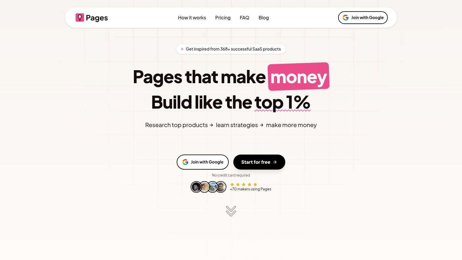
Pages.Report is an essential resource for anyone looking to master the art of conversion-focused design. While not a single landing page, it serves as a comprehensive library of high-performing call to action button examples and complete landing page strategies from over 368 successful SaaS companies. It's an indispensable tool for marketers, designers, and founders who want to move beyond guesswork and implement data-backed design patterns.
The platform meticulously deconstructs what makes top-tier SaaS landing pages convert, providing deep insights into UI/UX, value propositions, and copywriting. Its core strength lies in its ability to offer not just inspiration but actionable blueprints for success. This makes it an ideal starting point for anyone seeking to understand the "why" behind effective CTAs.

Why Pages.Report is a Top Resource
Pages.Report distinguishes itself by offering a holistic toolkit that goes far beyond a simple gallery of images. It provides a strategic advantage by dissecting the entire conversion funnel, with a special focus on how CTAs function within a broader design and messaging context.
- Deep Strategic Analysis: Each example is paired with a detailed breakdown, explaining the psychological principles, design choices, and copy that make the CTA effective.
- Ready-to-Use Assets: Users gain access to ready-made Figma designs and code components (Framer, Webflow, React), dramatically accelerating the implementation of proven designs.
- Continual Updates: The library is updated weekly with 50+ new landing page analyses, ensuring the content remains fresh and relevant in the fast-evolving SaaS landscape.
Key Features & User Benefits
| Feature | User Benefit |
|---|---|
| 368+ SaaS Landing Pages | Gain targeted inspiration from over 110+ SaaS categories, ensuring you find relevant and effective call to action button examples. |
| Personalized Audit (Pro) | Receive a detailed report on your own landing page, identifying specific, high-impact areas for improvement. |
| Lifetime Access Pricing | For a limited-time fee of $29, you get permanent access to the entire library and all future updates, offering exceptional long-term value. |
Access and Pricing
Getting started with Pages.Report is straightforward. You can begin exploring its resources for free without requiring a credit card. Full lifetime access is currently available for a one-time payment of $29, which includes all future content and platform updates. However, it's important to note that the free audit slots included in the Pro package are extremely limited, so new users might face a wait for personalized feedback. While its focus is squarely on SaaS, the principles and call to action button examples are widely applicable to any business aiming to improve its online conversions.
Website: https://pages.report
2. Envato Elements
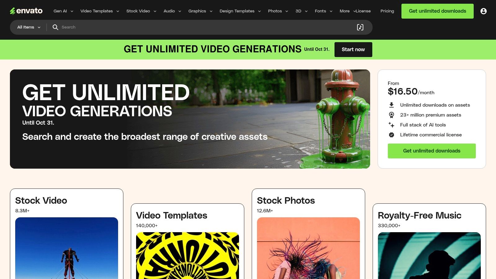
Instead of reinventing the wheel for every project, Envato Elements offers a massive shortcut for developers, designers, and marketers. It's a subscription-based marketplace providing unlimited downloads of millions of digital assets. For anyone looking for call to action button examples, Envato is a goldmine, offering countless pre-designed UI kits, landing page templates, and individual button assets that are ready to deploy.

The platform stands out by bundling millions of creative assets under a single, affordable subscription, moving away from the traditional per-item licensing model. This makes it incredibly cost-effective for agencies and freelancers who need a constant stream of high-quality design components.
Strategic Analysis & Key Features
Envato Elements isn’t just about quantity; the quality is consistently high because assets are submitted by a global community of professional designers. For teams building SaaS products, this means access to modern, user-tested design patterns without hiring a full-time design team. The platform also simplifies one of the biggest headaches in creative work: licensing. With a commercial license that covers most use cases and a simple per-project registration system, you can use assets with peace of mind.
Key Takeaway: By providing unlimited access to high-quality, pre-made UI kits and templates, Envato Elements empowers teams to rapidly prototype and launch professionally designed landing pages and applications, complete with effective CTA buttons.
Practical Application
To make the most of Envato Elements, start by filtering your search for "UI Kits" or "Web Templates" and then add keywords like "SaaS" or "Dashboard." This will reveal comprehensive packages with consistent styling, including a variety of button states (hover, active, disabled) already designed. You can also explore high-converting landing page examples from Envato Elements to see how these assets are used in practice.
- Pros: Huge library of assets, simple subscription pricing, clear commercial licensing.
- Cons: Requires an ongoing subscription for new downloads, specific items may be removed over time.
- Pricing: Subscription-based, with plans for individuals, teams, and enterprises.
Website: https://elements.envato.com/
3. Creative Market
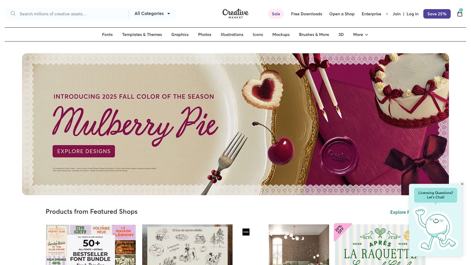
For designers and marketers seeking specific visual styles without committing to a subscription, Creative Market is an essential resource. It's a vast marketplace where independent creators sell digital assets, including high-quality UI kits and dedicated packs of call to action button examples. This model is perfect for one-off projects or for teams that prefer to purchase assets as needed rather than pay a recurring fee.

The platform’s strength lies in its diversity and pay-per-item model. You can find everything from minimalist button sets for modern SaaS applications to more illustrative CTAs for creative campaigns. Because you're buying directly from individual designers, you gain access to unique styles that might not be available on larger, subscription-based platforms.
Strategic Analysis & Key Features
Creative Market’s primary advantage is its granular purchasing model, supported by clear licensing tiers (Personal, Commercial, and Extended Commercial). This eliminates ambiguity and allows teams to buy precisely what they need. For SaaS startups, this means you can purchase a single, professionally designed button pack compatible with Figma or Sketch to ensure UI consistency without a major upfront investment. The marketplace structure also encourages competition among sellers, which helps maintain high quality and reasonable prices for premium assets.
Key Takeaway: Creative Market provides a flexible, a la carte solution for acquiring unique, professionally designed CTA button assets, empowering teams to enhance their UI with specific styles on a project-by-project basis without subscription lock-in.
Practical Application
To find the best CTA assets on Creative Market, use specific search terms like "SaaS CTA buttons Figma" or "modern web buttons Sketch." Pay close attention to the asset previews and descriptions to verify that they include necessary states like hover, pressed, and disabled. Always check the seller's ratings and reviews to gauge the quality and support level before purchasing. This approach ensures you get a ready-to-use component that fits your design system perfectly.
- Pros: One-time purchase options with clear license tiers, wide variety of visual styles and file formats, no subscription required.
- Cons: Quality can vary by seller, so previews and specs must be checked; no unlimited download option unless you join an optional membership.
- Pricing: Pay-per-item, with prices set by individual creators. Optional membership is available for discounts.
Website: https://creativemarket.com/
4. Figma Community (and Figma Learn)
For teams wanting to build effective CTAs from the ground up, Figma Community is an essential, free resource. It's a massive open platform where designers and developers share files, plugins, and UI kits. Anyone looking for call to action button examples can find thousands of production-grade components and interactive prototypes, moving beyond static images to understand how buttons actually behave.
The platform's main advantage is its direct integration with the Figma design tool. Instead of just viewing examples, users can duplicate entire UI kits with a single click and immediately start customizing them. This hands-on approach is invaluable for learning how to construct high-quality, interactive components for any SaaS application or landing page.
Strategic Analysis & Key Features
Figma Community is more than a repository; it's a learning hub. Alongside user-submitted content, Figma provides official tutorials and design kits, such as their Material 3 and Apple iOS kits. These resources offer a masterclass in building buttons that adhere to established, user-tested design patterns. The ability to inspect and deconstruct components created by experts provides unparalleled insight into creating states like hover, pressed, and disabled.
Key Takeaway: Figma Community provides direct, hands-on access to thousands of interactive CTA button examples and UI kits, empowering teams to not only find inspiration but also learn the technical principles behind building effective, production-ready components.
Practical Application
To get started, search the community for "Buttons," "UI Kit," or "Design System." Filter results by "Community" to see popular files with high duplicate and like counts, which usually indicates quality. For a deeper understanding of how these components are built, explore official tutorials on Figma Learn covering component variants and interactive prototyping. You can also explore user experience design patterns to see how these foundational UI elements contribute to a cohesive and intuitive product.
- Pros: Zero cost for access to starter kits and learning resources, rich learning content for building CTA behaviors, easy to modify components within Figma.
- Cons: Quality of community assets varies and needs vetting, some organizational and advanced features require paid seats.
- Pricing: Free access with a Figma Starter plan. Paid plans are available for advanced team features.
Website: https://www.figma.com/community
5. Mobbin
Instead of designing in a vacuum, Mobbin provides a comprehensive library of real-world mobile and web app screens, allowing you to see how the world's leading companies design their user flows. It's an indispensable research tool for product designers, UX researchers, and marketers looking for proven call to action button examples within actual user journeys. By showcasing real screens, Mobbin lets you deconstruct successful CTA placement, wording, and design hierarchy from the best in the business.
The platform’s core value lies in its extensive, up-to-date, and highly searchable database of real product interfaces. Unlike generic template sites, Mobbin offers a look into how CTAs function in context, from onboarding sequences to checkout flows, providing unparalleled insight into user experience design patterns that actually convert.
Strategic Analysis & Key Features
Mobbin is a strategic asset for competitive analysis and design inspiration. Its advanced filtering allows you to search for specific UI elements, like buttons or forms, across thousands of apps and websites. The "Flows" feature is particularly powerful, letting you trace a user's path through an app to understand how multiple CTAs work together to guide the user toward a specific goal. This contextual view is critical for understanding CTA effectiveness beyond just a single landing page.
Key Takeaway: Mobbin removes the guesswork from UI design by providing a searchable library of real, successful app screens, empowering teams to replicate proven CTA strategies and user flows from top-tier companies.
Practical Application
To effectively use Mobbin for CTA research, start by searching for a specific user flow like "onboarding" or "upgrade subscription." Filter by app category (e.g., "SaaS," "Fintech") to find relevant competitors. Use the Collections feature to save compelling CTA examples and compare different approaches side-by-side. This process allows you to quickly identify common patterns, effective microcopy, and visual hierarchies that you can adapt for your own product.
- Pros: Real-world examples from successful products, contextual user flows, affordable pro tier.
- Cons: It's a reference library only; you still need to design the components yourself. The most useful features require a paid plan.
- Pricing: Offers a free limited plan, with paid Pro and Team tiers for full access.
Website: https://mobbin.com/
6. Really Good Emails
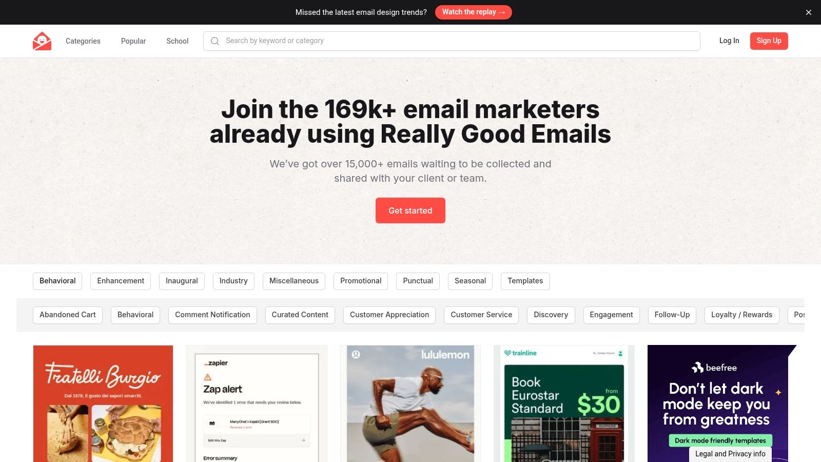
While landing pages get much of the attention, the inbox is where many critical conversions happen. Really Good Emails serves as a specialized gallery, curating over 15,000 real marketing emails from top brands. It's an essential resource for marketers and designers looking for call to action button examples specifically optimized for the unique constraints and user behaviors of email marketing, from color and copy to placement and size.

The platform’s value lies in its laser-sharp focus on one thing: email design. Instead of offering broad UI kits, it provides a searchable, filterable database of proven email campaigns. This allows teams to study how successful companies drive engagement through newsletters, lifecycle messages, and promotional campaigns, all without leaving their browser.
Strategic Analysis & Key Features
Really Good Emails is more than just a swipe file; it’s a tool for competitive analysis and creative inspiration. Users can filter emails by category (like "Welcome" or "Abandoned Cart"), company, or even specific keywords found in the email's copy. For SaaS teams, this means you can instantly see how competitors are phrasing their CTAs for new feature announcements or trial expirations. The platform also offers "Collections" for teams to organize and share their favorite examples, streamlining the design and copywriting workflow.
Key Takeaway: By providing a massive, curated library of real-world email campaigns, Really Good Emails allows marketers to deconstruct successful CTA strategies and apply proven design and copy principles to boost their own email conversion rates.
Practical Application
To get the most out of the platform, use the advanced search filters to narrow down examples relevant to your specific campaign goals. For instance, searching for "e-commerce" and filtering by "Order Confirmation" will show you how brands use post-purchase CTAs to encourage reviews or repeat business. Combining this visual research with foundational knowledge is key; you can find more strategies by exploring some of the latest conversion rate optimization tips to understand the psychology behind the designs you see.
- Pros: Highly specific focus on email CTA design and copy, fast inspiration from top brands, low-cost Pro plan with a free trial.
- Cons: Limited to email design, not full product UI kits; some advanced features require a Pro subscription.
- Pricing: Free to browse; Pro plans with advanced features like private collections are available.
Website: https://reallygoodemails.com/
7. Shadcraft – Figma CTA Blocks (shadcn/ui)
For designers and developers building with the popular shadcn/ui library, Shadcraft offers a purpose-built Figma UI kit that dramatically speeds up the creation of marketing pages. It provides a premium collection of production-ready CTA blocks and components, allowing teams to quickly assemble polished and modern call to action button examples and sections without starting from scratch.
The platform’s key advantage is its direct alignment with a specific, modern development ecosystem. Instead of offering generic templates, Shadcraft focuses on high-quality, themeable components that are structured for a seamless handoff to developers already using shadcn/ui. This specificity makes it an incredibly efficient tool for teams prioritizing both design consistency and development speed.
Strategic Analysis & Key Features
Shadcraft is more than just a component library; it’s a design system accelerator. The kit is optimized for Figma's latest features, including full support for variables, light and dark modes, and interactive prototyping. This means designers can create and test high-fidelity CTA sections that look and feel like the final product. The inclusion of Lucide icons and a clear structure based on a popular open-source library ensures the final output is both beautiful and easy for developers to implement.
Key Takeaway: By providing a focused, high-quality Figma kit built specifically for the shadcn/ui ecosystem, Shadcraft bridges the gap between design and development, enabling teams to build and ship cohesive, high-converting CTA sections faster than ever.
Practical Application
To get the most out of Shadcraft, designers should leverage the pre-built CTA blocks as a starting point and use Figma's component properties to customize them to fit their brand. The theming capabilities allow for quick changes to colors, fonts, and spacing that propagate across all components. For developer handoff, referencing the component names, which align with shadcn/ui, streamlines the entire implementation process, reducing ambiguity and potential errors.
- Pros: Saves significant design time, one-time purchase model, built for seamless developer handoff.
- Cons: Niche focus on Figma and shadcn/ui, smaller library compared to large marketplaces.
- Pricing: One-time purchase for lifetime access to the purchased version, with one year of updates included.
Website: https://shadcraft.com/blocks/cta
Call to Action Button Examples Comparison
| Platform | Implementation Complexity 🔄 | Resource Requirements ⚡ | Expected Outcomes 📊 | Ideal Use Cases 💡 | Key Advantages ⭐ |
|---|---|---|---|---|---|
| Pages.Report | Medium - includes ready code and Figma designs for faster adoption | Moderate - requires some design and marketing skills | High - proven SaaS landing page improvements and audits | SaaS landing page optimization and conversion growth | Data-driven insights, ready-to-use assets, ongoing updates |
| Envato Elements | Low - ready-to-use assets needing basic customization | High - subscription needed to access full library | Medium - broad asset availability for varied projects | Teams/agencies needing many UI kits and landing pages | Huge asset library, predictable pricing, commercial licenses |
| Creative Market | Low - instant downloads, no subscription | Low to moderate - pay per item | Medium - one-time use of specific UI kits or buttons | Buyers needing occasional design assets without subscription | Wide format support, reasonable pricing, no subscription needed |
| Figma Community (and Learn) | Low to Medium - free but requires design skills | Low - free access, Figma account required | Medium - access to community content and tutorials | Designers learning or customizing interactive buttons | Free, easy to customize, rich tutorials |
| Mobbin | Medium - research-focused; users create from references | Moderate - paid pro needed for advanced features | Medium - better UI/UX decisions from current app screens | UI/UX research for mobile/web apps focusing on CTAs | Real-world examples, flow context, affordable pro tier |
| Really Good Emails | Low - browsing library, no design needed | Low to moderate - free and Pro available | Medium - improved email CTA design and copywriting | Email marketing design and campaign optimization | Huge curated email library, focused on CTAs, chrome extension |
| Shadcraft – Figma CTA Blocks | Low to Medium - production-ready Figma components, requires Figma | Moderate - one-time purchase, Figma required | High - polished CTA sections ready for marketing sites | Fast assembly of modern CTAs within Figma workflows | High-quality components, one-time price, prototyping support |
Transforming Clicks into Conversions: Your Action Plan
We've explored a diverse set of call to action button examples, moving beyond generic advice to dissect what truly makes a CTA effective. The journey through tools like Envato Elements, Figma Community, and Mobbin has revealed that a high-converting button is never an accident. It's the result of deliberate design, strategic copy, and a deep understanding of user psychology.
The core lesson is this: your CTA isn't just a button; it's the final, crucial step in a conversation with your user. It’s the culmination of your value proposition, where you ask them to take a leap of faith. The most successful examples we analyzed share common threads: clarity, value, and a sense of urgency or benefit, all wrapped in a visually compelling package.
Key Takeaways and Your Next Steps
To translate inspiration into implementation, focus on these foundational principles:
- Clarity Over Creativity: A user should instantly understand what will happen when they click. Use strong, action-oriented verbs like "Start," "Get," "Join," or "Try" instead of vague terms like "Submit."
- Emphasize the "Why": Your button copy should reinforce the benefit. Instead of just "Sign Up," consider "Sign Up and Get 10% Off." This small change connects the action to a tangible reward.
- Design for Attention: Color, contrast, size, and placement are your allies. Your primary CTA should be the most visually prominent element on the page, guiding the user's eye and making the desired action effortless.
- Context is Everything: A CTA that works on a pricing page might fail on a blog post. Always consider the user's mindset and journey stage when designing your button and its surrounding copy.
Choosing the Right Tools for Your Workflow
The resources we've covered cater to different needs. Here's how to select the best one for you:
- For quick inspiration and ready-made assets: Envato Elements and Creative Market are invaluable for accessing a vast library of designs that you can adapt quickly.
- For deep UI/UX analysis and mobile patterns: Mobbin is the ultimate resource for seeing how successful apps implement their CTAs in real-world user flows.
- For design system integration and technical implementation: The Figma Community, along with resources like Shadcraft’s CTA Blocks, provides the building blocks to create consistent, scalable, and developer-friendly components.
To effectively transform clicks into conversions, you must see the bigger picture. Your CTAs are just one part of a larger system. Exploring proven product growth strategies can highlight the importance of every conversion point and help you build a more cohesive and effective user journey.
Ultimately, the best call to action button examples are those that are relentlessly tested and optimized. Don't just copy what works for others; use these examples as a starting point. A/B test your copy, colors, and placement. Measure the impact. The path to a truly high-performing CTA is paved with data, not assumptions. Your goal is to build a button that doesn't just ask for a click, but earns it.
Ready to analyze your own landing pages and see how your CTAs stack up against the best? Pages.Report gives you a curated library of high-performing marketing pages and components, making it easy to find inspiration and refine your conversion strategies. See what works and build better pages, faster, with Pages.Report.
