7 Best Web Page Footer Examples to Inspire You in 2025
The web page footer is often the final interaction a user has with a site, making it a critical, yet frequently overlooked, component of digital strategy. More than just a sitemap, a well-designed footer can drive conversions, build trust, and improve navigation. It’s the last chance to guide users toward key actions, whether that’s signing up for a newsletter, exploring career opportunities, or discovering important company information. A thoughtfully crafted footer reinforces brand identity and provides essential resources, turning a potential dead end into a valuable engagement point.
This article dives deep into the best platforms for discovering high-quality web page footer examples. We'll move beyond simple screenshots and provide a strategic analysis of what makes each design effective. For each resource, you'll find a breakdown of its strengths, direct links to explore, and actionable takeaways you can apply to your own projects. We will analyze everything from layout and link hierarchy to copywriting and micro-interactions. Understanding these components is fundamental, as they are key to applying user experience design best practices that ensure your footer serves its purpose effectively. This curated list will equip you with the inspiration and tactical insights needed to build a footer that not only looks great but also performs.
1. pages Homepage
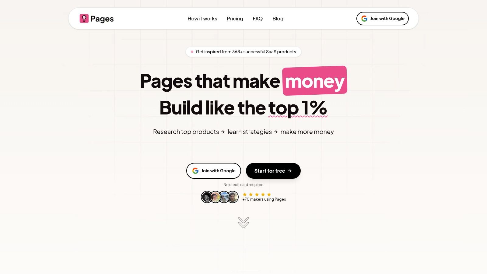
The footer on the Pages.Report homepage is a masterclass in clean, user-centric design that prioritizes both legal necessities and value-driven navigation. It forgoes complexity for clarity, making it an exceptional model for SaaS and information-based businesses. This design strategically funnels user attention towards key actions while ensuring trust and transparency.
Strategic Breakdown
This footer excels by adhering to a minimalist yet highly functional structure. The layout is dominated by a prominent call-to-action (CTA) button, "See all 368+ landing pages," which sits just above the main footer area. This placement acts as a final, compelling invitation for users who have scrolled through the entire page, capturing their high intent at a critical moment.
The core footer is neatly organized into two main sections. On the left, a concise brand statement ("Data-driven landing page inspiration") reinforces the site's value proposition. Below it, a copyright notice and a link to the terms and privacy policy handle essential legal requirements without adding clutter. This structure is a prime example of effective information hierarchy in web page footer examples.
On the right, a simple, two-column navigation menu provides direct access to vital resources. These links are carefully selected to guide users toward high-value content, including the blog and specific reports.
Actionable Takeaways & Replicable Strategies
Here are the key lessons marketers and designers can apply from the Pages.Report footer:
- Final-Chance CTA: Place your primary CTA just above the footer. This captures users who have shown interest by scrolling to the bottom, giving them one last, clear opportunity to convert.
- Minimalist Navigation: Don't overwhelm users with dozens of links. Curate a small selection of the most important pages that support user goals and business objectives, such as "Blog," "Pricing," or "Contact."
- Reinforce Value Proposition: Use a short, powerful tagline in your footer. This reminds visitors of your brand's core purpose and leaves a lasting impression.
- Separate Legal from Navigational: Group legal links (Terms of Service, Privacy Policy) with your copyright notice. This keeps them accessible but visually distinct from your main navigation, creating a cleaner user experience. For a practical example of a live website, you can explore the design and footer elements of the meetzest.com Homepage.
This approach not only organizes information effectively but also turns the footer into a strategic asset for conversion and brand reinforcement. To further refine your own designs, you can explore more insights on their blog about homepage design best practices.
2. Mobbin
Mobbin isn't a single website with a great footer; instead, it’s a massive, curated library where you can find thousands of real-world web page footer examples. This makes it an invaluable resource for designers, developers, and product managers seeking inspiration grounded in practical, shipped designs rather than purely conceptual ones.
The platform’s strength lies in its focus on production-grade UI. While other sites showcase speculative or "dribbblish" designs, Mobbin provides annotated screenshots from live applications. You can filter specifically for footer components, giving you direct access to how leading companies structure their final, crucial navigation space.
Strategic Breakdown and Key Features
Mobbin allows you to deconstruct what makes a footer effective by studying patterns across hundreds of examples. Its interface is clean, and the user experience is designed for efficient research.
- Real-World Implementation: See how successful brands handle legal links, social proof, newsletter sign-ups, and complex sitemaps in their footers.
- Advanced Filtering: Search and filter by UI elements (like footers), app categories, and design patterns to quickly find relevant examples.
- Team Collaboration: Pro plans enable users to create shared collections, making it easy to gather footer inspiration and collaborate with team members on design decisions.
Pricing and Access
Mobbin operates on a freemium model. The free plan offers limited access, showing only the latest 8 apps and websites with restricted search results. To unlock the full library, advanced filtering, and high-resolution downloads, you’ll need a paid subscription.
| Plan | Pricing | Key Benefit |
|---|---|---|
| Free | $0 | Basic access to the latest examples |
| Pro | $8/month (annual) | Full library access, unlimited search, downloads |
| Team | $10/user/month (annual) | Shared collections, centralized billing |
Actionable Takeaway: Use Mobbin not just for visual inspiration but to validate your footer’s information architecture. Analyze how similar companies organize their links to ensure your own footer meets user expectations and supports key business goals. Exploring these different structures can also provide excellent website layout ideas beyond just the footer.
Website: https://mobbin.com
3. Awwwards
Awwwards is a professional web design and development competition body that recognizes and promotes the best creative work on the internet. For those seeking web page footer examples, its dedicated inspiration gallery offers a curated look into the most artistic, innovative, and visually stunning designs from award-winning agencies and global brands.
Unlike platforms focused solely on UI patterns, Awwwards showcases footers within the context of fully realized, often experimental, websites. This makes it an exceptional resource for designers and creative directors looking to push boundaries and find inspiration that is both contemporary and highly polished. The collection is a testament to what’s possible when creativity is the primary driver.
Strategic Breakdown and Key Features
Awwwards is less about deconstructing user interfaces and more about sparking creative ideas. Its value lies in the sheer quality and artistic merit of the examples, which are perfect for mood boards and client presentations.
- Curated Excellence: Every example has been vetted by an international jury of experts, ensuring you’re only seeing top-tier, creatively ambitious footer designs.
- Dedicated "Elements" Gallery: The platform features specific pages for UI components, including a large, easily browsable collection of footers for focused inspiration.
- Diverse Aesthetics: Explore a vast range of styles, from minimalist and corporate to brutalist and interactive, helping you find a visual direction that aligns with your brand.
Pricing and Access
Browsing the inspirational galleries on Awwwards is completely free. Paid plans are available but are targeted toward professionals and agencies wanting to submit their work for awards, get listed in directories, or access educational content.
| Plan | Pricing | Key Benefit |
|---|---|---|
| Free | $0 | Full access to browse all inspiration galleries |
| Directory Plan | From €150/year | Get your agency listed in the professional directory |
| Pro Plan | From €249/year | Submit sites for awards, access courses, and more |
Actionable Takeaway: Use Awwwards to break out of conventional design patterns. While many examples are highly conceptual, they are excellent for borrowing specific ideas related to typography, micro-interactions, or unique link layouts. Challenge your team to adapt one innovative element from an Awwwards example into your more practical, user-focused footer.
Website: https://www.awwwards.com/inspiration/footer-design
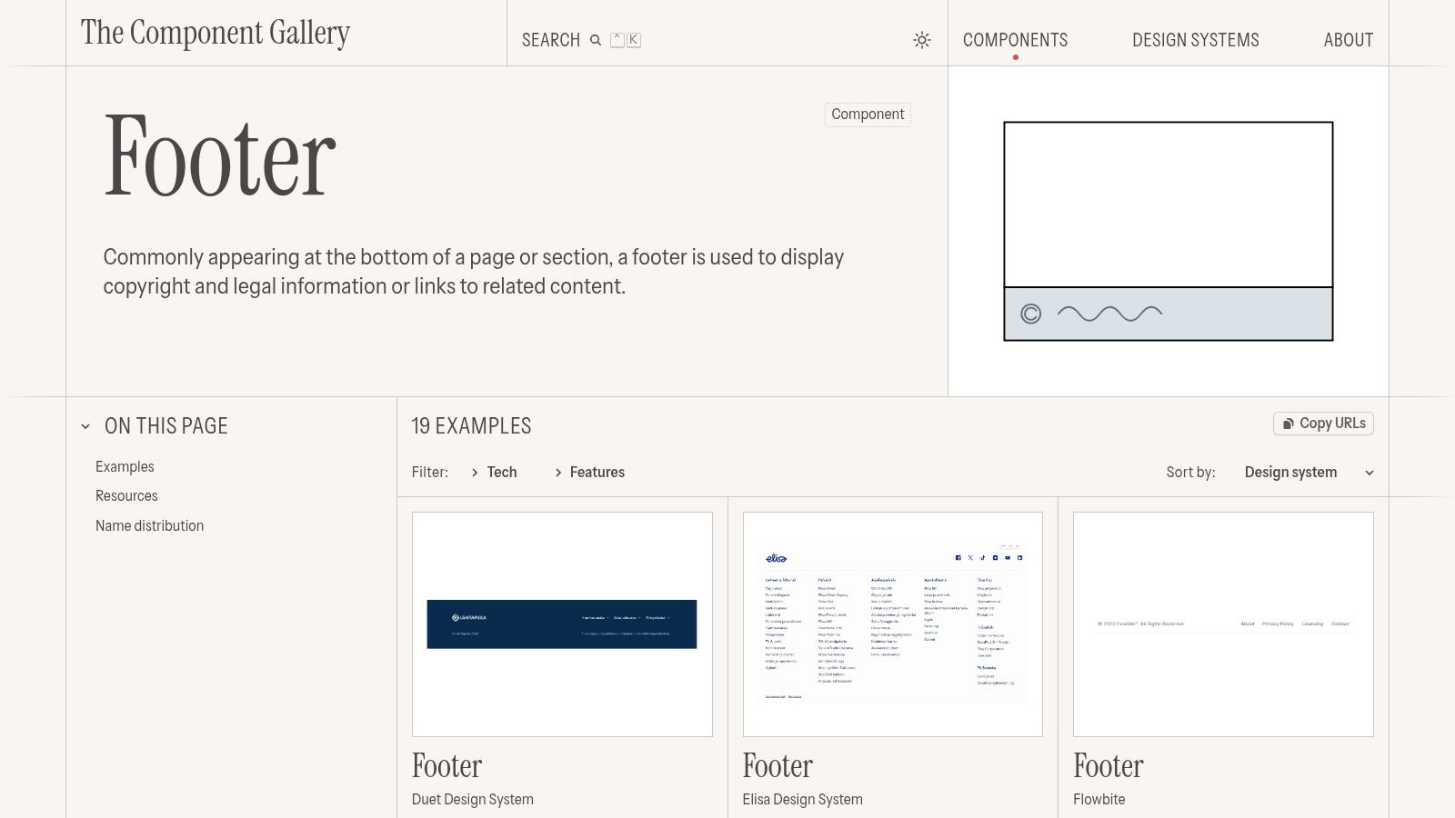
4. The Component Gallery
The Component Gallery serves as a vendor-neutral index of design system components, making it a goldmine for developers and designers looking for practical, standards-compliant web page footer examples. Rather than showcasing stylized or conceptual designs, it aggregates real-world footers from established design systems like GOV.UK, the U.S. Web Design System (USWDS), and Flowbite.
Its core value is its focus on implementation-ready components. Each example comes with direct links to official documentation, code snippets, and crucial accessibility (a11y) guidelines. This approach removes the guesswork, providing a blueprint for building footers that are not only functional but also accessible and robust, making it an essential resource for public sector projects or any application prioritizing usability.
Strategic Breakdown and Key Features
The Component Gallery excels at providing authoritative, no-frills solutions. It is less about visual inspiration and more about technical and structural integrity, allowing you to study and adopt battle-tested footer patterns from leading organizations.
- Standards-Compliant Examples: Access over 15 footer examples drawn directly from respected design systems, ensuring they meet high standards for usability and accessibility.
- Implementation-Ready Assets: Each component includes links to its code repository and official documentation, streamlining the path from inspiration to implementation.
- Accessibility Focus: By sourcing from systems like GOV.UK and USWDS, the gallery highlights footers built with accessibility at their core, offering valuable patterns for a11y compliance.
Pricing and Access
The platform's greatest strength is its open and free model. There are no paywalls, sign-ups, or limitations, making it a completely accessible resource for anyone.
| Plan | Pricing | Key Benefit |
|---|---|---|
| Free | $0 | Full, unrestricted access to all components |
Actionable Takeaway: Use The Component Gallery to benchmark your footer against established accessibility and usability standards. Instead of starting from scratch, adapt a footer component from a trusted design system to ensure your site's foundation is solid, compliant, and user-friendly, especially if your audience includes users with diverse accessibility needs.
Website: https://component.gallery/components/footer/
5. Landingfolio
Landingfolio is a highly curated design gallery focused specifically on high-performing landing pages. While its scope is broad, its dedicated section for web page footer examples makes it an essential resource for marketers, SaaS founders, and designers who want to see how top companies close their pages with impact. It features over 390 footer examples, each from a modern, conversion-focused context.
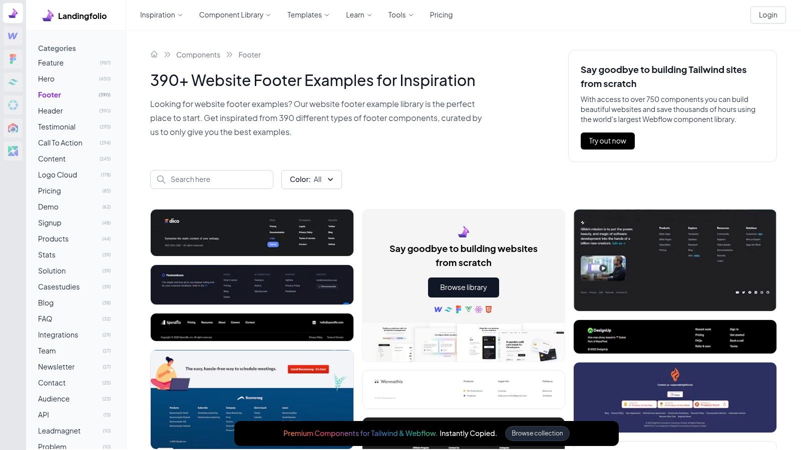
Unlike broader UI libraries, Landingfolio’s strength is its tight focus on marketing and SaaS websites. This means the footers you find here are built to persuade, build trust, and drive action. The platform’s clean, card-based UI is designed for rapid scanning, allowing you to quickly compare dozens of structures for audits or redesign inspiration.
Strategic Breakdown and Key Features
Landingfolio is ideal for understanding the anatomy of a marketing-centric footer. Its collection is less about comprehensive sitemaps and more about strategic link placement, trust signals, and final calls to action (CTAs).
- Conversion-Oriented Examples: Discover footers that masterfully integrate newsletter sign-ups, demo requests, and social proof.
- Component-Specific Categories: The site is neatly organized into components, allowing you to filter directly for footers and bypass irrelevant UI elements.
- Rapid Visual Audits: The grid layout enables you to gather diverse ideas for layouts, color schemes, and link organization in minutes.
Pricing and Access
Landingfolio offers a freemium model. You can browse a significant portion of the gallery for free, but full access to the entire library of components, including all footer examples, requires a Pro membership. The Pro plan is a one-time payment for lifetime access.
| Plan | Pricing | Key Benefit |
|---|---|---|
| Free | $0 | Limited access to a curated selection of examples |
| Pro | $79 (one-time) | Lifetime access to the entire library of 3,000+ components |
Actionable Takeaway: Use Landingfolio to benchmark your footer against current marketing trends. Pay close attention to how other SaaS and e-commerce sites use their footers to reinforce their brand, present key value propositions, and provide a final opportunity for conversion. Analyzing these designs is a great way to generate ideas for your own high-converting landing pages.
Website: https://www.landingfolio.com/components/footer/
6. Creative Market
Creative Market isn't a single site with a standout footer; it’s an expansive online marketplace where designers can find thousands of professionally crafted, ready-to-use web page footer examples and UI kits. This makes it a go-to resource for those who need a high-quality, legally licensed footer design quickly, without starting from scratch.
Unlike inspiration-only platforms, Creative Market provides tangible assets. You can purchase footer templates in multiple editable formats like Figma, Sketch, PSD, and even production-ready HTML/CSS. This bridges the gap between seeing a great footer and implementing one, offering a shortcut for designers, developers, and entrepreneurs looking to accelerate their workflow.
Strategic Breakdown and Key Features
Creative Market’s strength lies in its variety and accessibility. It allows you to quickly find a footer style that matches your brand and download the source files for immediate customization.
- Diverse Template Library: Access a massive selection of footer UI templates from thousands of independent creators, covering every style from minimalist to complex, multi-column layouts.
- Multiple File Formats: Templates are often available in several formats (Figma, Sketch, Adobe XD, Photoshop), providing flexibility to work within your preferred design tool.
- Clear Licensing: Each asset comes with straightforward licensing options, including Personal, Commercial, and Extended Commercial, ensuring you can legally use the designs in your projects.
- Instant Implementation: Many offerings are part of larger UI kits, giving you a consistent design system, while others are standalone HTML/CSS components for fast integration.
Pricing and Access
Creative Market allows for both individual asset purchases and a membership model. You can buy any template with a one-time payment, or subscribe to a membership for credits, discounts, and free monthly assets.
| Purchase Type | Pricing | Key Benefit |
|---|---|---|
| One-off Purchase | Varies by asset | Pay only for what you need with no commitment |
| Membership | From $19.95/month | Monthly credits, member discounts, and free assets |
| Credits | Varies by pack | Buy credits in bulk for future purchases |
Actionable Takeaway: When browsing Creative Market, filter for recently updated or created assets to ensure the designs follow modern UI/UX principles. Always read vendor reviews and check the included file formats before purchasing to guarantee compatibility with your workflow. This is an excellent way to source a professional footer layout and customize it to fit your brand’s specific needs.
Website: https://creativemarket.com
7. Envato Market (CodeCanyon)
For developers and founders looking to accelerate development, Envato's CodeCanyon is a marketplace of pre-built code components, including a wide array of web page footer examples. Instead of building from scratch, you can purchase ready-to-use HTML, CSS, and JS footer packs built with popular frameworks like Bootstrap and Tailwind CSS.
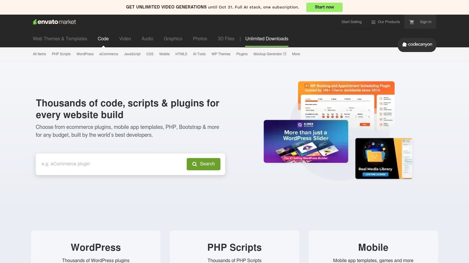
This approach is ideal for projects where speed and budget are top priorities. The platform offers access to countless footer designs-from simple, minimalist layouts to complex, multi-column structures-that can be integrated into a project in minutes. These code snippets are created by a community of developers, providing a diverse selection of styles.
Strategic Breakdown and Key Features
CodeCanyon serves as a practical toolkit for implementing a footer without the overhead of custom design and development. Its strength lies in providing functional, documented, and affordable code components that solve a common web development need.
- Ready-to-Use Components: Most footer packs include multiple responsive variants, allowing you to choose the best fit for your layout.
- Clean Markup and Frameworks: Items often come with W3C-validated HTML, well-organized CSS (or Sass/utility classes), and documentation for easy customization.
- Budget-Friendly: Sourcing a footer this way is extremely cost-effective, with many high-quality packs available for under $10.
- Quick Implementation: Saves significant development time, letting teams focus on more complex, business-critical features instead of boilerplate UI.
Pros and Cons
While CodeCanyon offers immense value, it's important to understand the trade-offs of using a marketplace for pre-built code.
| Pros | Cons |
|---|---|
| Significant time savings with ready-to-use sections | Code quality can vary by author and may need review |
| Very budget-friendly with a massive selection | Updates are not guaranteed and depend on the original creator |
| Uses popular frameworks like Bootstrap and Tailwind | Licensing is often limited to a single end product per purchase |
Actionable Takeaway: Before purchasing, thoroughly check the item's comments, reviews, and last-updated date. This helps verify the code quality and ensures the author is still actively maintaining the product. Use these components as a reliable starting point, but always be prepared to customize the styling to perfectly match your brand's unique visual identity.
Website: https://codecanyon.net
Web Page Footer Examples Comparison
| Platform | Implementation Complexity 🔄 | Resource Requirements ⚡ | Expected Outcomes 📊 | Ideal Use Cases 💡 | Key Advantages ⭐ |
|---|---|---|---|---|---|
| Pages Homepage | Medium - requires understanding data-driven insights and some design tweaks | Moderate - subscription needed for full access | High - improved conversion rates and revenue growth | SaaS companies optimizing landing pages | Data-backed strategies, Figma files, competitor insights |
| Mobbin | Low to Medium - browsing patterns and downloading assets | Moderate - free limited, Pro plan boosts access | Medium - faster design reviews and handoffs | UI designers needing real app UI patterns | Real shipped UI designs, strong filtering, downloadable assets |
| Awwwards | Low - browsing and inspiration only | Low - free access for browsing, paid for learning | Medium - broad creative inspiration | Designers seeking polished, creative footers | Extensive, current examples from top studios, free browsing |
| The Component Gallery | Low - ready-to-use code and components | Low - free with no signup required | High - implementation-ready, accessible footers | Developers needing accessible, standards-compliant footers | Free, accessibility-focused, authoritative code samples |
| Landingfolio | Low - quick visual scanning | Moderate - partial free access, Pro for full library | Medium - faster inspiration and idea comparison | Marketers/designers focusing on conversion footers | Large variety, marketing-focused footers, easy to scan |
| Creative Market | Low - instant download, ready templates | Low to Moderate - pay per item, no subscription | Medium - fast customization with licensed assets | Designers purchasing customizable footers | Wide selection, multiple formats, legal licenses |
| Envato Market (CodeCanyon) | Low - plug-and-play footer packs | Low - single purchase, very affordable | High - quick footer implementation via code packs | Developers needing coded footers fast | Budget-friendly, responsive variants, popular frameworks |
From Blueprint to Build: Crafting Your High-Converting Footer
We've explored a powerful collection of resources, from the curated design systems on Mobbin to the competitive showcase at Awwwards, each offering unique perspectives on effective web page footer examples. The journey has taken us through practical code snippets on Envato Market and the polished, real-world components in The Component Gallery. It's clear that a footer is far more than a simple sign-off; it's a strategic asset for navigation, trust-building, and conversion.
The examples analyzed reveal a consistent truth: the best footers are built with intention. They don’t just list links; they organize information, anticipate user needs, and provide clear, final pathways for engagement. They are meticulously designed to be the safety net that catches users before they bounce, turning a potential exit into a new opportunity.
Key Takeaways for Your Footer Strategy
As you move from inspiration to implementation, remember these core principles distilled from our analysis:
- Hierarchy is Non-Negotiable: A cluttered footer is an ignored footer. Use columns, typography (bolding, font size), and negative space to guide the user's eye to the most critical information first, whether that's your primary CTA or essential legal links.
- Think Function Over Form: While aesthetics matter, every element must serve a purpose. Does that social media icon drive meaningful engagement, or is it just taking up space? Every link should answer a potential user question or direct them toward a valuable next step.
- Contextual CTAs Convert: Your footer is prime real estate for a final conversion push. Instead of a generic "Contact Us," consider a more specific call to action that aligns with your business goals, like "Get a Demo," "Subscribe to Our Newsletter," or "Explore Our API."
Your Actionable Next Steps
With these insights and a wealth of examples at your fingertips, it’s time to build. Here’s how to translate this knowledge into a tangible outcome:
- Define Your Footer's Primary Goal: What is the single most important action you want a user to take from your footer? Is it lead generation, brand discovery, or support access? This goal will dictate your entire design.
- Audit Your Existing Content: Map out all the links and information you currently have or need. Group them logically into categories like "Product," "Company," "Resources," and "Legal." This structure forms the blueprint for your columns.
- Select the Right Tool for the Job: Your choice of tool depends on your immediate need. Are you in the early stages of wireframing? Use Mobbin or The Component Gallery for structural ideas. Seeking cutting-edge visual inspiration? Awwwards is your go-to. Need a ready-made solution to implement quickly? Envato Market or Creative Market have you covered.
- Sketch and Iterate: Before writing a single line of code, create a simple wireframe. Test different column layouts and CTA placements. This low-fidelity approach allows you to solve structural problems quickly and ensure your final design is both user-friendly and goal-oriented.
Ultimately, the most effective web page footer examples demonstrate that this often-overlooked section is a powerful tool for enhancing user experience and achieving business objectives. By applying these strategic principles and leveraging the right resources, you can transform your footer from an afterthought into a high-performing asset that works tirelessly for your brand.
Inspired by all these examples but not sure how your own pages stack up? Pages.Report provides detailed, automated UX audits and expert analysis of your key pages, including your footer. Get an actionable report to see exactly where you can improve user experience and boost conversions at Pages.Report.
