Build Landing Pages That Convert
Landing pages that actually convert aren't a happy accident. They’re the product of a sharp, deliberate strategy.
The pages that win do so because they have a single, clear objective. They speak directly to a specific person's problems and lay out an offer so good it feels like the only logical next step. Every single element, from the headline down to the button color, is engineered to steer the visitor toward taking that one specific action.
Why Some Landing Pages Convert and Others Fail

The real difference between a page that fills your pipeline and one that just burns through your ad budget is the work you do before you even think about design. A failing page tries to be a jack-of-all-trades, cluttered with mixed messages and a buffet of calls to action. A successful one is a masterclass in focus.
The average landing page conversion rate sits around 6.6% across all industries. But that number can be deceiving. Ecommerce might hover around 4.2%, while the top performers in that same space can hit 11.4% or even higher. That huge gap shows just how much a solid plan can move the needle.
Defining Your One True Goal
Before you write a single word of copy, you have to lock in your page’s one and only objective. This isn’t a fuzzy goal like "get more leads." It needs to be specific, measurable, and crystal clear.
Is your primary goal to:
- Generate qualified leads for your sales team through a demo request form?
- Drive free trial sign-ups for your SaaS product?
- Sell a specific product directly from the page?
- Grow your email list by offering a valuable ebook or webinar registration?
This single goal is your North Star. Every headline, image, sentence, and form field must support this one objective. Anything that distracts from it needs to be cut without mercy.
A landing page with one call to action has one job. A landing page with five calls to action has no job at all. It's just a confused visitor waiting to click the 'back' button.
Understanding Your Audience and Competition
Once you’ve got your goal, you need to get inside the head of the person on the other side of the screen. What are their biggest frustrations? What language do they use to talk about their problems? Really digging into the "why" behind their actions is crucial; you can learn more about how to boost online sales with consumer psychology.
At the same time, a quick peek at the competition is essential. Check out the landing pages of your direct competitors. The goal isn’t to copy them—it’s to find the gaps. What are they not saying? Where is their message weak? That's where you find your unique angle and build a value proposition that truly stands out from the noise. Nailing this groundwork is a cornerstone of effective landing page conversion rate optimization.
Essential Elements of a High-Conversion Page
To tie this all together, here's a quick-reference table of the non-negotiable components every landing page needs to succeed. Think of this as your pre-flight checklist before you start building.
| Element | Purpose |
|---|---|
| Compelling Headline | Grabs attention immediately and promises a solution to the visitor's problem. |
| Clear Value Proposition | Answers the question "What's in it for me?" in a single, powerful statement. |
| Persuasive Copy | Speaks directly to pain points and explains how your offer solves them. |
| Engaging Visuals | Shows your product or service in action and helps visitors visualize the outcome. |
| Trust Signals | Builds credibility with testimonials, case studies, partner logos, or security badges. |
| Focused Call to Action (CTA) | A single, unmissable button that tells the user exactly what to do next. |
Getting these core elements right isn't just best practice; it's the foundation upon which every successful landing page is built. It ensures your message is clear, your offer is compelling, and your visitor has a frictionless path to conversion.
Designing for Trust and Action

Great landing page design isn't about winning art awards; it's about winning trust. The very best landing pages that convert use design as a psychological tool to make the desired action feel like the most natural, obvious next step. Every choice, from color to spacing, is a deliberate move to eliminate friction and build instant confidence.
Your design’s number one job is to create a clear visual hierarchy. You need to guide your visitor's eye on a specific journey, starting with the headline, moving through the value proposition, and landing squarely on your call-to-action (CTA). If everything is shouting for attention, nothing gets heard.
Establishing a Clear Visual Path
A strong visual hierarchy turns a cluttered page into a clear, persuasive argument. It tells visitors exactly where to look and in what order. A few simple adjustments can make a world of difference in directing focus where it truly matters.
Here’s how to carve out that path:
- Size and Scale: Your headline should be the largest text on the page, hands down. Subheadings come next. Your CTA button needs to be prominent and visually distinct from everything else around it.
- Whitespace: Don't be afraid of empty space. In fact, embrace it. Generous whitespace around key elements like your form or CTA makes them stand out and feel far less intimidating. It gives them room to breathe.
- Color and Contrast: Use color with purpose. A bright, high-contrast color for your CTA button makes it impossible to miss. Keep the rest of your palette simple to avoid overwhelming the user with visual noise.
Think of your landing page as a well-lit path through a dark forest. Each design element is a lamp post, lighting the way to the final destination: your CTA.
Building Trust with Authentic Visuals
Let's be honest: stock photos of smiling business people in a boardroom don't build trust. They often do the exact opposite, screaming "we couldn't be bothered to use real pictures." Authentic imagery and social proof are your most powerful allies for building credibility.
Visitors form an opinion about your website in about 50 milliseconds. High-quality, authentic visuals are critical for making that first impression a positive one.
Incorporate elements that show real people and real results. We're talking high-quality product videos, customer testimonials with actual headshots, or logos of well-known clients. These are instant trust signals that prove you’re a legitimate business delivering real value. For more ideas, you can explore different testimonials page design strategies.
A Mobile-First Design Imperative
Assuming your audience is on a desktop computer is a massive, costly mistake. Over 83% of landing page visits now happen on mobile devices. A mobile-first approach isn't a nice-to-have anymore; it's an absolute necessity for creating landing pages that actually convert.
This means you design for the smallest screen first, then adapt the layout for larger devices. It’s a complete shift in thinking.
| Mobile-First Priority | Why It Matters |
|---|---|
| Large, Tappable Buttons | Ensures easy interaction for thumbs and prevents frustrating mis-clicks. |
| Single-Column Layout | Makes content scannable and easy to digest without annoying horizontal scrolling. |
| Simple, Short Forms | Reduces typing and friction, making it way easier for users to complete on the go. |
| Fast Load Times | Mobile users are impatient. Optimize your images and scripts to get that page loaded in under three seconds. |
When you prioritize the mobile experience, you ensure your page is accessible and effective for the vast majority of your visitors. It’s a fundamental change that directly impacts your ability to capture leads and drive action.
Writing Copy That Actually Sells

Let's be clear: a slick design might get visitors to stick around for a few seconds, but it's your words that get them to act. The copy is the engine of your landing page. It's what connects with a visitor's problems, builds trust, and convinces them your solution is the one they've been looking for.
Without compelling copy, even the most beautiful landing pages that convert poorly are just expensive digital art.
It all starts with the headline. You have a tiny window—maybe three seconds, tops—to grab someone's attention and communicate your core value. A weak headline means your visitor is already gone before they even scroll.
Crafting a Headline That Hooks
Your headline isn’t just a title; it’s a promise. It has to instantly answer the visitor’s unspoken question: “What’s in it for me?” Any headline that’s vague, overly clever, or focused on your company is a conversion killer. You need to be ultra-specific and laser-focused on the benefit.
Think about the single biggest outcome your visitor wants. Frame your headline around that transformation.
- Weak Headline: "Revolutionary Project Management Software"
- Strong Headline: "Finish Projects 2X Faster and Never Miss a Deadline Again"
The second one works because it speaks directly to a painful problem and promises a concrete result. It shifts the entire focus from what your product is to what it does for the customer.
From Features to Benefits
One of the most common copywriting mistakes I see is just listing features. Nobody wakes up in the morning wanting a drill bit; they want the hole it creates. Your copy has to connect every single feature to a meaningful outcome for the person reading it.
The easiest way to do this is with the "so what?" test. For every feature you list, keep asking "so what?" until you hit a real human benefit—like saving time, making more money, or just feeling less stressed.
A feature is what your product does. A benefit is how your customer's life gets better because of it. Your landing page copy should be at least 80% benefits and only 20% features.
Let's run a feature through the test:
- Feature: Our app has a one-click integration with your calendar.
- So what? It automatically syncs all your meetings.
- So what? You never have to manually enter appointments again.
- Benefit: Stop wasting 30 minutes a day on scheduling and reclaim your focus for work that matters.
That final benefit is what actually sells. It’s the emotional payoff that resonates. To make sure your message hits home, using solid content optimization strategies is key to making these benefits shine.
Building Believability with Social Proof
You can tell people how amazing you are all day long, but they're naturally skeptical. This is where social proof becomes your most powerful ally. It’s an outside voice validating your claims, proving you can actually deliver on your promises.
Sprinkle different forms of social proof throughout your page, especially near key decision points like your CTA button.
Here are a few formats that work incredibly well:
- Direct Testimonials: Use quotes from real customers that highlight specific, tangible results. Always include their name, company, and a photo if you can—it boosts credibility tenfold.
- Impressive Numbers: Showcase hard data like "15,000+ teams use our platform" or "$10M in revenue generated for our clients." Big numbers build instant trust.
- Customer Logos: Displaying the logos of companies you work with, especially well-known ones, acts as a powerful, instant endorsement.
Sharpening Your Call to Action
Finally, we get to the Call to Action (CTA). The copy on your button needs to do more than just say "Submit." It should be an urgent, compelling command that reinforces the value the visitor is about to get.
Ditch the generic CTAs and try something benefit-focused instead:
| Generic CTA | Compelling CTA |
|---|---|
| Submit | Get Your Free Audit Now |
| Download | Unlock My Ebook |
| Sign Up | Start My 14-Day Free Trial |
This small tweak in wording makes a huge psychological difference. It changes a boring instruction into an exciting, value-driven step that feels like a win for the user, pushing them right over the finish line.
Optimizing Your Forms and CTAs
The final moments before a user converts are without a doubt the most critical. Your form and your call-to-action (CTA) are the last hurdles a visitor has to clear, and even the smallest bit of friction here can send them bouncing away. An otherwise perfect landing page can fail right at the finish line.
Honestly, this is where many of the biggest conversion wins are hiding in plain sight.
A well-designed form shouldn't feel like an interrogation. It should feel like a simple, logical next step. It’s about respecting the user's time and only asking for what's absolutely necessary to give them the value you promised.
Striking the Right Form Length Balance
There’s a never-ending debate about the perfect form length, but the answer is actually pretty straightforward: your form should be as long as it needs to be, but not a single field longer. You're constantly trying to balance gathering essential data for your team against minimizing the effort for your user.
Shorter forms almost always get more conversions, but you might end up with a pile of lower-quality leads. On the other hand, a longer form will likely scare off the casual browsers but deliver highly qualified prospects who are genuinely invested in your offer.
To figure this out, work backward from your goal. If you're offering a simple ebook download, an email address is probably all you need. But if you’re booking demos for a high-ticket service, asking for company size and job title is completely reasonable—it helps you qualify the lead.
This trade-off is central to building a page that converts the right kind of customer. Always question every single field. Is asking for a phone number essential right now, or will it cause a huge drop-off? The only way to know is to test it. We’ve seen that just reducing form fields from 11 to 4 can boost conversions by as much as 120%.
Crafting a Compelling Call to Action
Your CTA is the trigger. It’s the final instruction that kicks off the entire conversion. Its design and copy have to work together to create an unmissable, compelling command. This goes way beyond just picking a bright color and calling it a day.
Think about these crucial elements for your CTA:
- Placement: Your main CTA should live above the fold. No one should have to scroll to find it. If you have a longer page, repeat the CTA after any big sections of copy so a user never has to hunt for it.
- Wording: Ditch generic words like "Submit." Instead, use strong, action-oriented verbs that scream value. Try "Get My Free Template" or "Start My Trial." This simple shift frames the action as a direct benefit for the user, not something they're just giving to you.
- Contrast and Size: The button needs to visually pop off the page. Use a color that stands in high contrast to your background. It should also be large enough to be easily tappable on a phone without being obnoxious.
If you want to get a better feel for what makes a button truly irresistible, spending some time analyzing these powerful call-to-action button examples can spark some great ideas. Seeing how top-tier companies use psychological triggers in their CTA copy can help you move from writing basic instructions to crafting persuasive invitations that drive clicks.
How to Test and Improve Your Landing Page
Launching your landing page isn’t the end of the project—it’s the start of the real work. The highest-performing landing pages that convert are never really "finished." They’re living documents, constantly tweaked and refined based on how real people actually use them. Your best guess gets you to the starting line, but only data will get you a better conversion rate.
This process of continuous improvement isn't about massive, risky redesigns. It's about making small, intelligent changes backed by evidence. Think of it less like a demolition and more like a careful renovation, swapping out one tile at a time to see what looks best.
A/B Testing Your Way to Success
The cornerstone of all landing page optimization is A/B testing, sometimes called split testing. It's a simple idea: create two versions of your page—a control (Version A) and a variation (Version B)—and show each to a segment of your audience to see which one performs better.
The absolute key here is to change only one significant element at a time. If you change the headline, the button color, and the main image all at once, you’ll have no idea which change was responsible for the lift (or dip) in conversions.
Always start with a clear hypothesis. A good one sounds like this: "Changing the CTA button text from 'Submit' to 'Get My Free Audit' will increase form submissions because it focuses on the value the user receives." This gives your test a purpose and a clear metric for success.
A tiny tweak can lead to a huge win. Simply changing a CTA button color from green to red has been shown to boost conversions by 21% in some tests. It’s not about which color is universally "best," but which one stands out the most in the context of your design.
What to Test for the Biggest Impact
You can test nearly anything on your page, but you don't have the time to test everything. It's critical to prioritize the elements that have the most direct influence on a user's decision to convert.
Here are the heavy hitters to focus on first:
- Your Headline: This is your first and often your only chance to grab someone's attention. Test different angles—try a benefit-driven headline against one that asks a provocative question.
- Your Call to Action (CTA): This is a big one. Test the button text, color, size, and even its placement on the page. A small wording change can make a massive difference.
- Your Offer: Frame the same offer in different ways. Is it a "Free Trial" or a "Demo"? Is it a "Guide" or an "Ebook"? The language you use shapes its perceived value.
- Media: Try a video of your product in action versus a static hero image. For some audiences, seeing is believing, and a short video can outperform a picture every time.
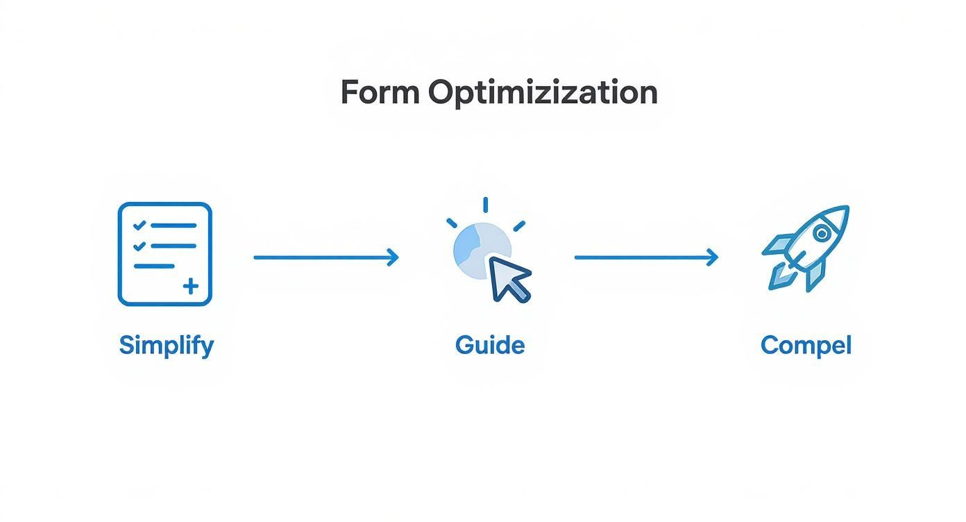
This infographic breaks down a simple process for improving one of the most crucial parts of your page—the form itself.

The key takeaway is a three-part approach: simplify the fields you ask for, guide the user through the process, and compel them to finish with a strong value proposition.
Going Beyond the Numbers with Qualitative Data
A/B tests are great at telling you what is happening, but they don't always explain why. This is where you need to bring in qualitative tools like heatmaps and user session recordings.
Heatmaps give you a visual map of where users are clicking, scrolling, and moving their cursors. They can instantly show you if people are completely ignoring your CTA or getting frustrated trying to click on something that isn't a link.
Session recordings take it a step further, letting you watch anonymized videos of real user sessions. You can see exactly where they hesitate, get confused, or ultimately decide to abandon your page. These insights provide the "why" behind your data, helping you form much smarter hypotheses for your next round of A/B tests.
Common Landing Page Questions Answered
Even with the best strategy in place, a few nagging questions always seem to pop up when you're in the trenches building landing pages. Getting these sorted out helps you build with confidence and sidestep the common mistakes that can quietly kill your conversion rates.
Let's clear up a few of the most frequent ones I hear.
How Many Landing Pages Do I Actually Need?
The short answer is, you need one dedicated landing page for every single campaign. If you're running three different Google Ads campaigns targeting three unique audiences, you guessed it—you need three separate landing pages.
Each page's messaging, visuals, and offer need to speak directly to that specific group. A one-size-fits-all landing page is a recipe for disaster because it ends up connecting with no one. It’s the difference between a tailored suit and a poncho; one fits perfectly, the other just sort of hangs there.
What Is a Good Conversion Rate?
This is the million-dollar question, and the only honest answer is: "it depends." You'll see stats thrown around, like the median conversion rate across industries sitting at 6.6%. But that number is almost useless without context. A great rate for a SaaS company might be 11.6%, while a top-performing e-commerce page could hit 11.4%.
Your goal shouldn't be to hit some generic industry average. A "good" conversion rate is simply one that's better than it was last month. Focus on improving your own baseline through constant testing and optimization. That’s the only benchmark that truly matters.
Should I Remove the Navigation Menu?
For almost any lead generation or sales-focused landing page, the answer is a resounding yes. Your landing page has one job and one job only: to get a visitor to take a specific action.
A navigation menu is like putting a bunch of shiny exit signs in a movie theater. It introduces dozens of ways for a visitor to get distracted and wander off before they reach your call to action.
By stripping away the main navigation, you create a focused, contained experience. The only way forward is the path you've laid out for them. This single tweak is one of the easiest ways to lift your conversion rate by eliminating distractions and keeping your visitor on task.
Ready to stop guessing and start building pages based on what actually works? At Pages.Report, we've dug into over 368 successful SaaS landing pages to uncover the patterns and insights you need. Get started with Pages.Report today!
